
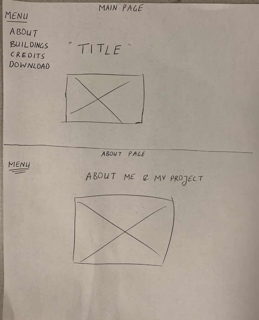
Wireframes – Hoang Anh Just
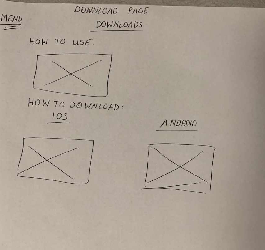
I will make an introductory website to talk about my project and give necessary instructions to how to use and install the Augmented Reality application on the phone. I will make a WordPress website, where I could either scroll down to go through the whole website or use the scalar linking pages that can go from one site to the next one. I will have a simple ‘ABOUT’ page, where I will talk about my project motivation and about project itself. Then, I will go to ‘BUILDINGS’ page, which contains all my content for the AR app and even more detailed information that the AR app could not contain. After showing all the content, we will go to the ‘CREDIT’ page with credits and bibliography. At the end, the user can read the instructions about the AR app and install it on the ‘DOWNLOAD’ page.
WEBSITE:

AR APP:

Wireframes- Erik Carneal
Wireframes – Emmarie Toppan
My wireframes are in the attached word document and contain an outline of my home page, a list of the pages that I’m likely going to have, and an outline of what the average page will look like.
Wireframes – Michaela Crow
Link to my wireframe made in pages.
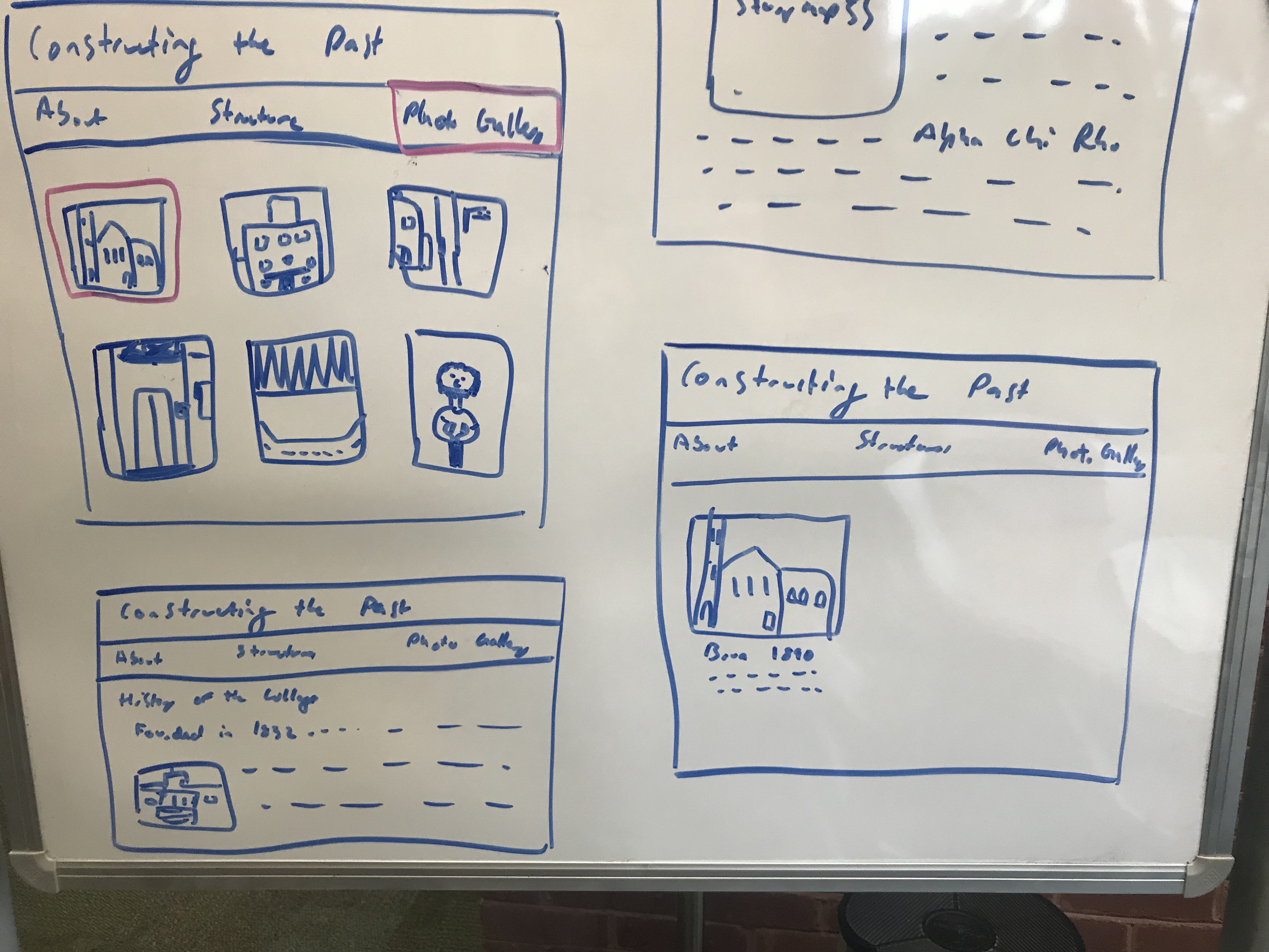
Wireframes – Maci Mark
Here are the Wireframes for Constructing the Past
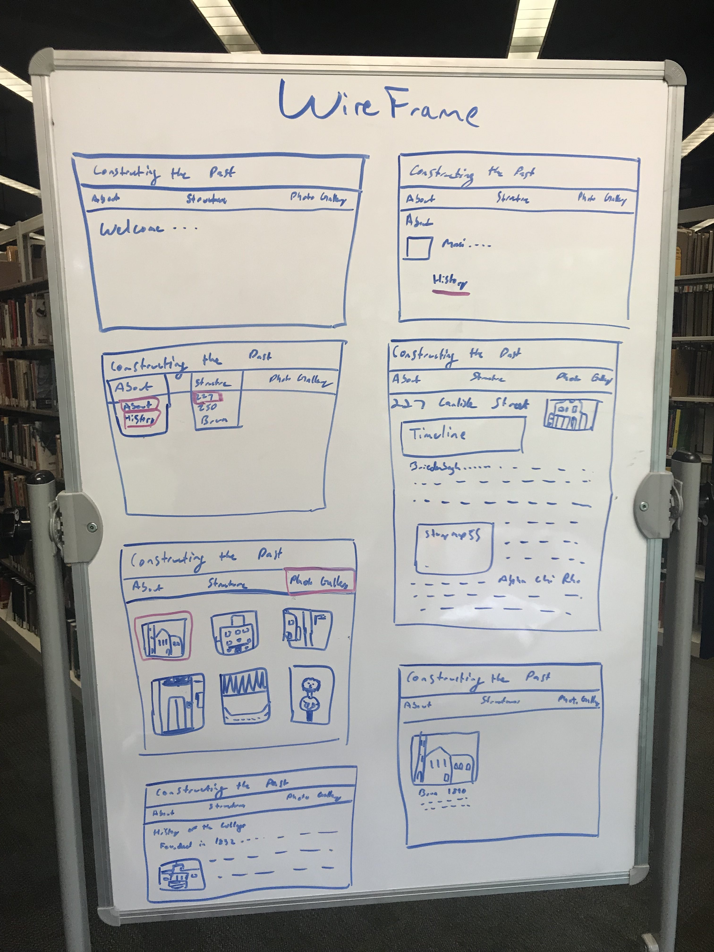
The homepage, about page, buildings pages, and the selection menus

A larger view of building page and what the photo gallery would look like
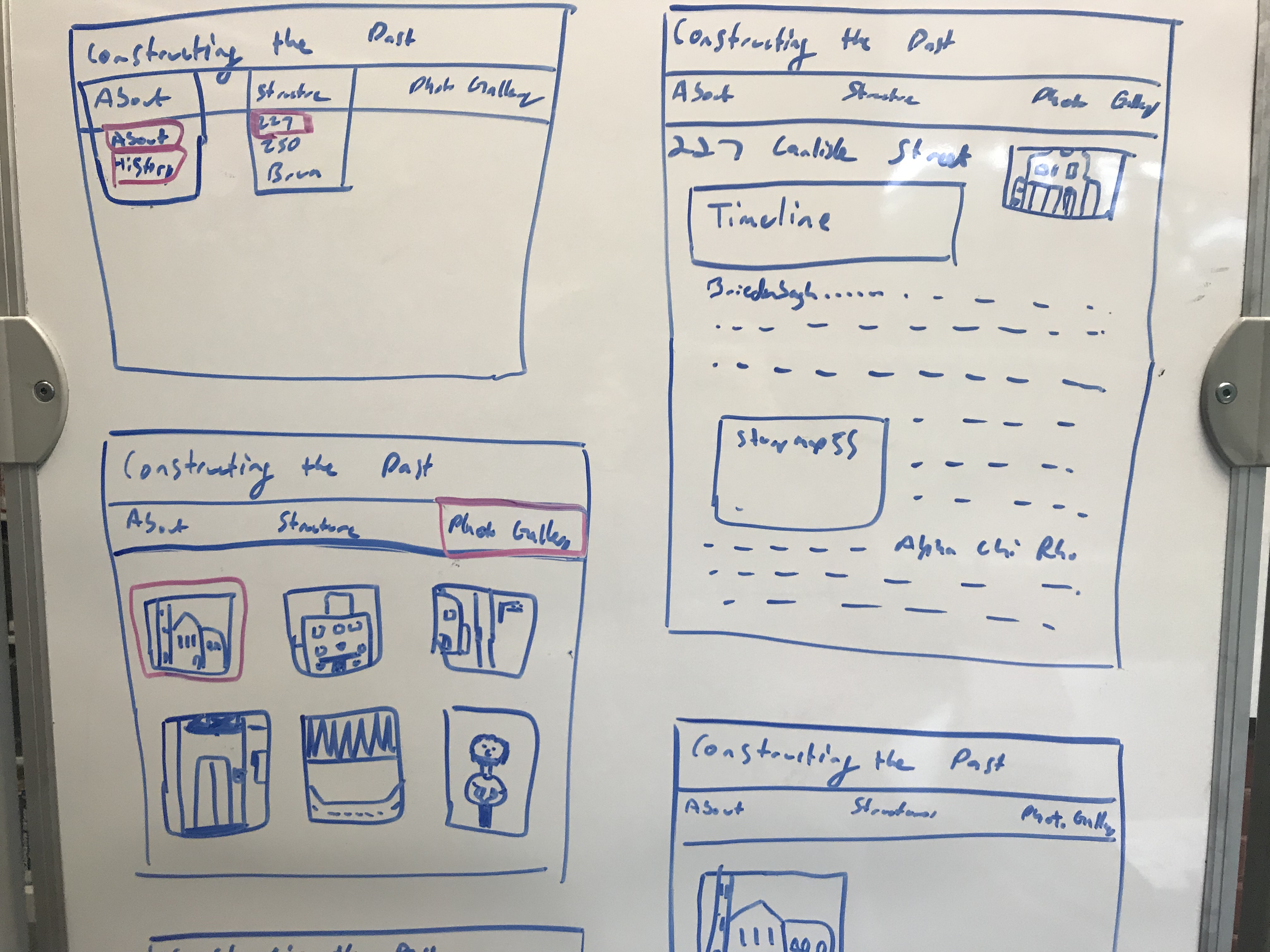
A closer look at the History of the College, which is under the About tab and the page for when you click on an image in the photo gallery
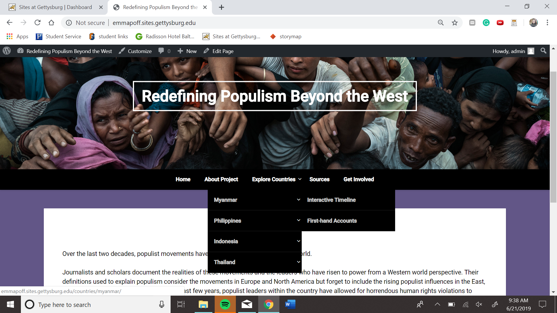
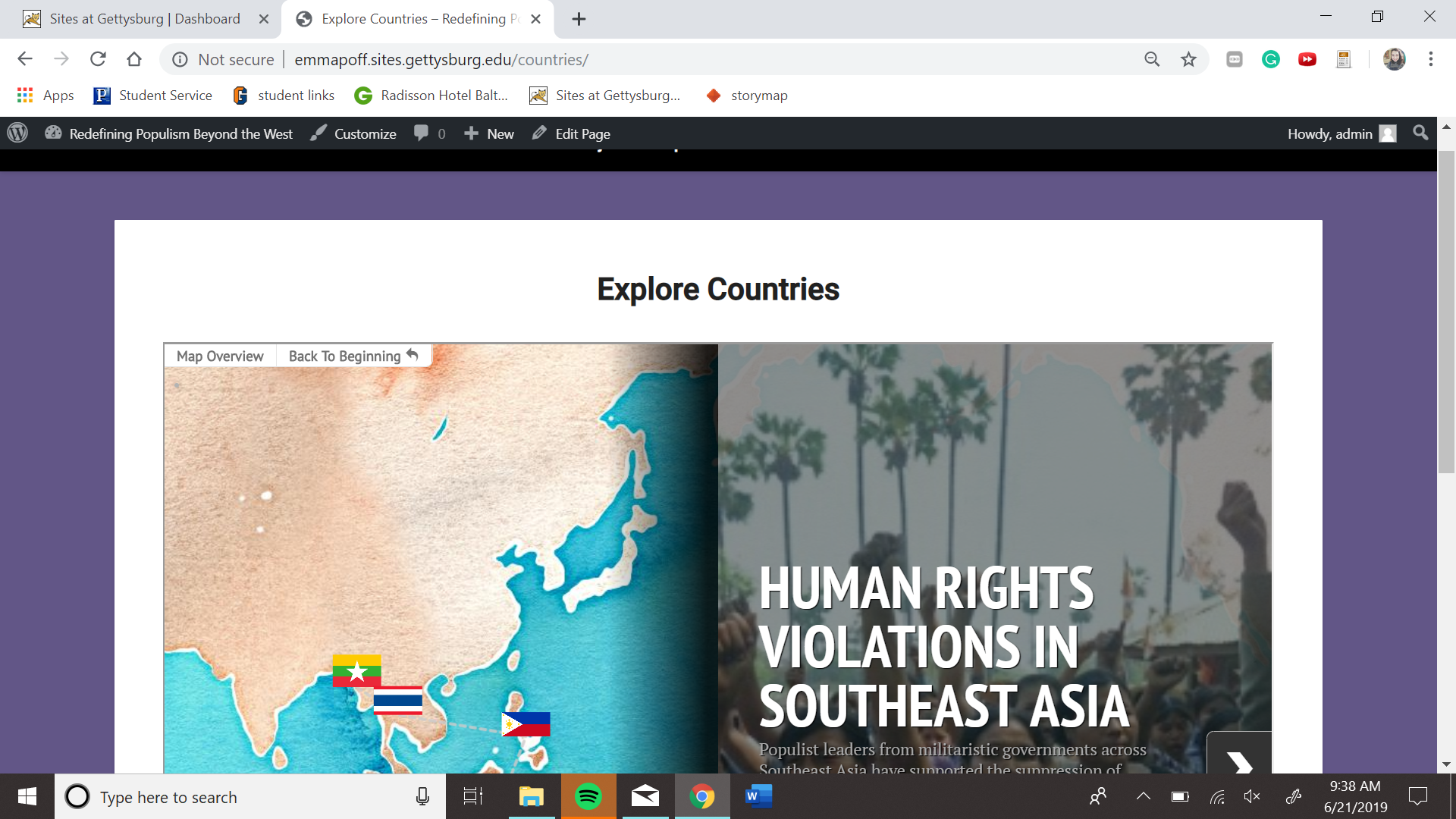
Evaluating TimelineJS -Emma Poff
I decided to critically evaluate the digital tool, TimelineJS and relate the tool to the values of the Digital Humanities community. TimelineJS is completely open to anyone with a Google account. Because a Google account is completely free beyond the user having to sacrifice some level of privacy when browsing on the website, this requirement for TimelineJS follows the Digital Humanities’ community value of openness.
Anyone can use the tool without any boundaries beyond having Google. TimelineJS. But, there is an exception to this requirement. If a user is concerned about their privacy and does not wish to have a google account with a google form publish to the public. They can use an iframe embed code with a JSON coding format. If the user knows how to code and can follow instructions on the website with the help of Javascript, creating a timeline should be feasible for them. This option for those concerned about privacy follows the DH tool evaluation from Miriam Posner.
Some features within this timeline tool include the ability to add media of any form such as videos, audio, links to social media, photography, or other digital tool embedded into the timeline. With the help of code, TimelineJS also allows users to boldface words, edit font, and change the overall appearance of the timeline. TimelineJS gives users the chance to break dates into eras with color coding. Users can also have multiple timelines at once to show differing data for different reasons needed by the user.
I think this digital tool can be used by a general audience with little knowledge of coding. The website offers a template to basically insert any information you have as well as multiple examples of frequently asked questions for anyone confused. The only bias I notice is how it assumes all users are English speaking and that users either know how to code or access google forms. Even with the template, some users may be confused even beyond the help page on the website.
Overall I think this digital tool clears as an effective and reliable tool to present research when being evaluated. Access to the tool is almost completely open to the public and free, even for those who wish to protect their privacy. The tool offers detailed help for the amateur user like myself and gives users options for how to edit appearance and presentation of materials. I plan to use this tool to present my research because it gives me the chance to place media within a timeline of facts and show the progression of the countries I am examining over time.
Reflection #2- Erik Carneal
One of the tools that we learned during this week of the DSSF program was TimelineJs. TimelineJs is important to me because I plan to use it to present my research in my project. TimelineJs allows you to input data regarding an image and a text related to that image into an interactive timeline. The timelines are very easy to learn how to make because it allows the user to import said information into a Google Form, which is then converted into the timeline. Google Drive programs, like Google Form, are very simple and allow for a wide range of accessibility considering the basic aspects of the tool. This digital tool can help a scholar or researcher visualize the time of their data and it makes it easy to find certain facts and events based on their time in history. This tool is great for visual learners who like to see the information presented as interactive or within something that is interactive. This tool if free to use, which adds to the open accessibility aspect of the digital tool. All it takes to use this tool is a simple download which helps with its popularity. This tool is not necessarily for scholars who look to make an extremely complicated timeline. TimelineJs seems more for scholars who are either just learning about digital tools or who are trying to make a simple site for a project or presentation.
This tool seems to have little bias considering how simple and open it is. TimelineJs allows for any user to input any data they wish, which automatically makes it a non-bias tool. The creators have made no harsh assumptions. The only assumptions the creators made was that people using it are not as advanced, therefore it is made to be easy. This tool is seems easy to master, which is great for college scholars who have little experience with digital timelines. I plan to use TimelineJs to timeline bias reports leading up to the 2016 election. I believe that the simple visual aspect of the tool will be good for my project and allow for whoever is accessing it to have no trouble navigating the site. TimelineJs allows for both images and videos to be imputed, which means that my data can be presented in a variety of ways within the timeline. Video news broadcasts as well as news transcripts can both be seen on the timeline leading up to the election. TimelineJs seems to be one of the most simple tools that we have learned yet. Even though it is simple, the end product that it creates seems very professional and clean. I see myself using TimelineJs for projects outside of this one, and other digital humanities projects can certainly benefit from this program as well. Unrelated, this tool is not only easy but it is fun to use. The end product of a professional looking timeline that you have complete control of it what makes this tool fun to use. Overall, this tool seems very helpful for my project and for scholarly projects I wish to tackle beyond this.
TimelineJS Evaluation
For the purposes of this critical evaluation, I will be focusing on the TimelineJS tool. I intend to use TimelineJS as the primary tool for my digital scholarship project. As such, critically reflecting on its biases and limitations in relation to the values of the Digital Humanities community is essential to creating a final product also in line with those values.
According to its creators, TimelineJS is an “open-source tool that enables anyone to build visually rich, interactive timelines.” At its core, the tool only requires a Google account to input information into a spreadsheet. From there, users can build their historical narratives using a template provided by the site. Additionally, users can use media from other sources like Twitter, Flickr, YouTube, Vimeo, Vine, Google Maps, Wikipedia, etc. This offers additional opportunities for collaboration.
Diving more deeply into this using the Criteria for Digital Tool Evaluation , I would conclude that while it does have inherent flaws, TimelineJS largely meets the criteria set by the evaluation tool. Some criteria that stood out to me is, firstly, TimelineJS is free to use. Anyone with a computer who wants to use it to display their data can do so without being limited by economic barriers. Along a similar line, the tool doesn’t require any sort of professional background. If you have internet access and the time to learn how to navigate the tool, you can use it successfully. The TimelineJS site even includes a video tutorial to assist new users. Very basic html code can be required, but if an amateur like me can figure it out, I am confident that anyone can. Of course, experts are able to create a more complex final product, such as using JSON to create custom installations. The site also provides answers to frequently asked question. Overall, TimelineJS meets the openness criteria of Digital Humanities with flying colors.
In terms of inherent limitations to accessibility, TimelineJS is clearly intended for an English-speaking audience. This also extends to support questions, which the site moderators specifically state can only be answered in English. I address this while also acknowledging that such a limitation is practically unavoidable. There will likely always be language barriers affecting who has access to what information depending upon who created the tool.
Overall, TimelineJS seems like a great tool for both new and savvy members of the DH community. Thus far, the tool seems like an excellent way to display historical events in a narrative form. For projects like mine, it can clearly demonstrate the evolution of events over time. Although it is limited by language and access to basic computer skills, all of the tools that we have encountered so far are similarly limited.
Analyzing StoryMapJS
The StoryMapJS digital mapping tool allows the user to either have a section of a map or a still image and then choose points to add commentary or more information. This mapping tool is different from other mapping tools because it allows you to map a still image. Other mapping tools only allow mapping of geographic maps. This tool can be helpful for pointing out historic locations on a map or when using still images highlight important points. In my project looking at historical architecture it can be used in a variety of ways. I can use it to explore before and after images, showing two images and pointing out how things have changed. Or I can just use it to point out architecture features and add a commentary about the reasons for them. This tool has good user experience design in mind because it does not make people have to scroll across the map, it just jumps from point to significant point, and it lets the viewer see the big picture in the beginning.
This tool is free to use which makes it accessible to anyone with access to the internet. To use this tool the user just has to either choose a location or upload an image. In order for it to be used the user has to upload all of the information that they want displayed, the tool just organizes the information into a map. The site for the tool does not give information on the privacy or who owns the data that is input. The about page of the site does not list when the code for the tool is updated but they have people currently working on it at Knight Lab, so it could be assumed that it is kept pretty up to date. It also gives information about what code to change if you want it to appear in different ways. StorymapJS does not have much bias in the way it allows for any information to be added making it pretty accessible. This tool is not very tricky to figure out, although it does go faster with someone there to show how it is done.
I can definitely use this tool in my Digital Humanities project because it will allow me to annotate photos I take of the different buildings on campus as mentioned previously. I also think that this tool embodies a lot of the Digital Humanities core values, one of them being its openness. This tool is free to use, which gives a lot more access versus a tool that needs a subscription to or one that needs to be paid for, like WordPress. It is also relatively simply to use which makes it accessible to people who are just starting out in Digital Humanities. It does not allow for much experimentation because it is set up in a pretty straightforward way that cannot be changed. Another core value of Digital Humanities is diversity and while it is hard for a digital tool to be diverse it is still important for the creators to be diverse and when taking a look at who helped to create StoryMapJS at the Knight Lab it is both racially diverse and diverse in its inclusion of undergraduate and graduate students.