My Homegirl MCW

The project is called Martha Washington: A Life (http://marthawashington.us/), it is about the life and history of Marta Custis Washington, wife of General and Former President George Washington. The project was a collaboration between George Washington’s Mount Vernon, a private non-profit that runs the Mount Vernon Home, and the Center for History and New Media.
The target audiences for this online project are school groups and visitors that go to Mount Vernon or want to know more about Martha Washington. It especially has a focus on school groups because it includes lesson plans for middle and high school teachers; it even has the national history standards for schools.
The questions that this project seeks to answer are: Who was Martha Washington? How did she live and what was her life like in Mount Vernon and how was her life affected by the events and institutions of the time?
The project is pretty easy to navigate; there is a menu that divides the site into four sections: Martha’s biography, teaching materials, archive, and resources. The front page gives a description of the menu sections and has links.
The writing is not only clear, succinct, and precise but it is also easy to read and does not use difficult or advanced terms. The writing was obviously meant for the public, not a hard-core Martha Custis Washington biographer; however it does not come across as condescending to someone’s intelligence.
The link to the about page is at the bottom of the site, it has the staff and information about both of the foundations. There is some technical information about the site included in the information about the staff that worked on the site in what they did to contribute to the site. It says that it is powered by Omeka on the bottom of the site and in one of the staff’s information it said that he “implemented the design and did all of the custom programming for the website on the Omeka web publishing platform.”
Digital assets in the form of artifacts, pictures, and documents obtained by the Mount Vernon foundation were used. Metadata is readily available because it is an Omeka powered website which puts its importance on metadata. Omeka is an online exhibition tool that lets you identify, log, and present artifacts and pictures. In my experience, there’s not much to Omeka besides a display of pictures and artifacts but this project did more than I ever expected from Omeka.
This project is unique in the way that the artifacts coincide with the writing. Like for every section of Martha’s life there are artifacts that coincide with the story, such as the courtship between George and Martha, off to the side it has artifacts one of them being a garnet necklace believed to be from early in the marriage of George and Martha Custis Washington. It brings the artifacts and pictures to life in the context of the story that is being told which is rarely done even in physical exhibits but overall very pleasing to me.

-Julia

History has its eyes on you

I spent the larger part of Thursday and Friday researching in special collections. The more I researched, the more I realized how scant my sources were. As it stands, the information I plan to use in my project largely relies on individual photographs, or small written anecdotes, rather than a comprehensive and fully fleshed history. The noticeable lack of materials made those sources that I could find all the more significant to me, and helped me to realize that we are constantly documenting and shaping our own histories through the memories we immortalize through pictures, words, or sounds.Even if they seem commonplace in the moment, we cannot anticipate the importance they may hold in the future.

Sound: A Different Dimension

In looking for what digital project to write about for this week’s reflection, I stumbled upon a very unique digital project called Sound and Documentary in Cardiff and Miller’s Pandemonium by Cecilia Wichmann. It can be found at http://scalar.usc.edu/works/pandemonium/index.

This project was created as a digital companion to a student’s master’s thesis, “Sound and Documentary in Cardiff and Miller’s Pandemonium”, and was completed in Spring 2015 in the Department of Art History and Archaeology at the University of Maryland, College Park. The student decided to create this Scalar project because she thought “sound art deserves a format suited to listening as well as looking and reading. My aim is to offer an accessible, informal, and flexible experience of my research.” Since this was meant as a companion to a Masters thesis, it is safe to assume that the audience is a scholarly group of people who share the same interest in art and sound. But this project can also be viewed by anyone who stumbles across it.

This project seems to be analyzing the intersection of sound art and documentary to better understand both fields of practice through the organized sound and silence of the composition Pandemonium. Overall, the site functions as a typical Scalar site. The front page is very clean and simple, directing the viewer where to go next. Although the project is written in conversational language, the very nature of the topic is sometimes hard to understand because the topic is very non-traditional.

Even though the topic itself is hard to grasp,, the author does a very good job of explaining it in her numerous About and Information pages. The Welcome page gives the viewer a brief and concise overview of the project. If the viewer would like to learn more, they can read a more in depth description on the Project page. From my browsing of the project I could see that the site was a Scalar site and most of the media was done within the Scalar platform (nothing embedded). The author uses various images, texts, audio, and video in her project. What I though was really nice about her project is that she had an All Media page where you could see every image, text, video, and audio in her project. If you clicked on the link to an image or other form of media, there was decent metadata if you explored further. In conclusion, everything was very well documented.

The author mostly just used Scalar as her main way of displaying her project. I assumed Scalar was chosen because it could move in the traditional way of a thesis paper (by chapter) while also allowing the use of image, audio, and video. On the Project page, the author really explained how she wanted her audience to be able to listen to the sound of Pandemonium. I believe that the audio inserted throughout the project is one of the main things that you wouldn’t be able to learn from a traditional research paper. Although the author does include images and video, you can easily add a flat image into your paper and you could have understood her project well enough without the video. The audio component of this project is what makes this thesis unique and gives the audience a better understanding of the project.

Exploring Identities

For this week’s blog, I chose to review Identities: Understanding Islam in a Cross-Cultural Context which is hosted on an Omeka platform. It can be found at http://marb.kennesaw.edu/identities/.

The project was created by Museums and Community Collaborations Abroad (MCAA).  Its aim was to use a variety of sources to create an exhibit that examined the cultural similarities and differences between the materials (especially oral histories and photographs) in a museum in Morocco and the materials from a museum in Georgia.  MCAA planned to analyze these materials and infer how identities are formed in immigrant communities, both in Morocco and Georgia.

Though not explicitly stated, it seems like the site is meant to appeal to a general audience, and especially highlight and connect with immigrant Muslim communities.  The central question the project asks is how identities are formed in these communities, both in Morocco and Georgia.  The project also centers on the idea of integrating community in general—by featuring community input in the exhibit, the project becomes a community itself.

Identities is an easy project to explore. My favorite aspect is that it’s structured, but still allows the user to take their own path through the website.  The homepage uses a slideshow tool to draw in the user and highlight various parts of the exhibit. Because the slideshow never goes in the same order twice, users can expect to explore a different part of the exhibit each time they visit. The writing on the website is informative and interesting without being dense, especially with regard to the photo captions.

The website features an about page that provides a comprehensive overview of the project and all the museums and organizations that helped to make it. However, there is not information about the specific digital tools they used to make the website. The metadata on the website is comprehensive and follows dublincore formatting.

     Identities’s most compelling feature that distinguishes it from a traditional research paper or exhibit is how easily a user can bring themselves into the website’s narrative. A tab on the home page named “talk back” allows users to either share their story or answer a survey that asks questions about how the user views Islam or what further topics they’d want to see included in the exhibit. Instead of being a passive experience, Identities is active because it fully immerses and incorporates the user.

The Freshmen Fifteen is Nothing Compared to these Freshmen Customs

It seems that the rite of passage for college freshmen is to indulge in their unlimited meal plan and gain the freshman fifteen.   But the freshman fifteen is nothing compared to the freshman customs women had to follow in the 1950s. The freshmen customs were a set of rules that freshmen had to follow for a period of time throughout the first semester. These rules consisted of wearing ridiculous hats called dinks, not being allowed to walk on the grass, running errands for upperclassmen, not being allowed to wear makeup, and following many more humiliating rules. Looking at these rules, I wondered, if I were going to college in the 1950s would I have been able to follow them?

Researching these rules allowed me to really imagine what it would be like to be a woman attending college in the 1950s. It gave me a glimpse into the life of a co-ed freshman. The rules are tangible, and if I wanted to I could try to follow them for one month. Although I probably won’t try to replicate these customs, they will be displayed in my digital project. I hope that my audience will be able to picture themselves in these women’s shoes in the same way I have been able to, and appreciate the culture of a different time and how far women have come.

Collaboration At Its Finest

In the beginning of this fellowship, the cohort talked about collaboration as being an important value of digital humanities. As the weeks pass by, I feel that our three DSSF fellows (plus a Mellon) have really learned how to collaborate with one another.  Since Christina and I are both researching Gettysburg College Women’s History, it was natural for us to collaborate with one another. Since week one we were bouncing off ideas and sending information and documents to one another. Christina’s project also lines up very nicely with Lauren’s project about social justice movements throughout Gettysburg College history and they have often talked about similar themes seen in their research. Even though Julia’s topic doesn’t revolve around Gettysburg College history, she doesn’t keep her findings to herself. I can tell you that I have never been more knowledgeable in Civil War military history before. We have also been able to collaborate with our supervisors (through both twitter memes and the digital humanities). I am excited to make progress in my research and continue to collaborate with my supervisors and co-workers as the weeks progress.

“And love is love is love is love is love”

cw: This blog post will discuss the events that occurred in Orlando on Sunday, June 12th


In light of the shooting that occurred at Pulse nightclub early Sunday morning, I have been devoting a lot of thought to the vision and goal of my project.

It is obvious that there is still a need for people to take action and a stand for the rights of those communities who are the targets of hate and discrimination. College students have the unique opportunity to not only shape their institution’s history, but also to learn from one another and consequently advocate for the values of acceptance and respect in the world outside of their undergraduate career.

The readings and discussions we have encountered as a part of this fellowship have stressed the communal aspect of the digital humanities. Creating a timeline that incorporates past and present social justice movements effectively establishes a community of people who can learn from one another’s experiences. It is my earnest hope that my website users will be inspired by the social movements that have occurred at Gettysburg College and take action to further advance the causes begun by others so that campus communities and the world in general are righteous places where all people, regardless of identity, can thrive.

ZeeMaps

ZeeMaps is a mapping tool that has multiple marking tools and annotative abilities. ZeeMaps is different from other mapping tools in its simplicity, it is literally just a map that you can add annotations to or connect markers. Other mapping tools like StoryMap JS or ArcGIS try to present their maps like stories, which is great for presentation but the presentation takes away from the map itself in some regards.

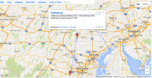
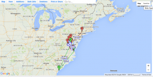
ZeeMaps would help me in regard with the visualization of the journeys of all the cadets through the war and would show their connections since many of them were at the same battles or arsenals. Using the Connect tool, you can connect multiple locations which can show the individual journeys of cadets.

This is an example of a connection on ZeeMaps

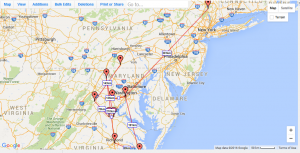
However, what I at the current moment cannot figure out is how to turn off the distance calculator for the connections because it makes it quite messy and you cannot see the connections or markers as well.

Alonzo Cushing's Journey in ZeeMaps
Alonzo Cushing’s Journey in ZeeMaps

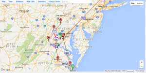
What makes ZeeMaps super helpful to me is that it has the ability for different colored markers and connections that can easily differentiate the cadets.

Cushing is red and O'Rorke is green
Cushing is red and O’Rorke is green

ZeeMaps is free except a couple of features that require payment to use. The features that you have to pay to use are just bulk features so really, you get the full experience of ZeeMaps for free.

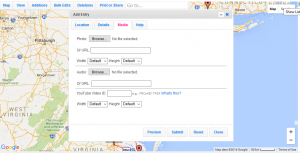
ZeeMaps only requires location to put down a marker, but there are many features that you can add to the markers such as: title, annotations, media, audio, youtube videos, pictures, etc.

Options of Media in ZeeMaps

ZeeMaps is very easy to use, no expert needed. Every feature on ZeeMaps can be figured out and explained easily. Even if you already put down a marker, it can be easily edited, removed, what have you. There is no html, CSS, JavaScript experience needed to work ZeeMaps unless you wanted to edit the code itself.

I could very well use this tool in my project. I have shifted my thinking from doing a huge timeline/map that encompassed each cadet into making a timeline for each cadet individually and a big map for a visual reference, showing their journeys and the connections in their journeys. While ZeeMaps does not have the neat presentation of other mapping apps like StoryMap JS and ArcGIS, it would serve the purpose of showing the cadets’ journeys. But it does have very very simple presentation which I think might clash with the aesthetic of my project, but I could see if it would look better while embedded into a website. Another downside to ZeeMaps is that there are only 31 markers, I need at least 38 for all of my cadets. However, with all 38 cadets, the map will get messy and confusing and I am not really sure how to handle that at this current moment, but I am sure that I will figure it out with more experimentation and work on ZeeMaps and other mapping tools.

Hot Mess of Markers
Hot Mess of Markers

An Evaluation of Timeline JS

Timeline JS is a free digital tool that allows a user to create a customized digital timeline. Its ease of access, both in accessing the tool and using it, make it unique.

Organizing research in a chronological format is a useful way to show trends and development. Using a timeline in my project will show how various events at Gettysburg influenced the others. I can also create parallel timelines that detail what social justice movements were taking place on other college campuses and across the nation. Because of the way Timeline JS is structured, I can embed multiple forms of media (such as Youtube videos or pictures) so that I can visually represent the people who were involved in each social justice instance.

Timeline JS is well known and documented. The timeline JS website has a documentation page featuring tips for beginners as well as links to FAQs and support forums. There is information about the Northwest University Knightlab (the Timeline JS creators) at the bottom of each page, and they provide means of contact.

Timeline JS provides each user with a template that adapts the user’s research and formats it into a timeline. The first thing the template asks for is the beginning and end dates of the event. The next section asks for a display title for each event, and a brief description of what happened. These titles can be hyperlinked to other pages.  The template also provides a space for including media and documenting and captioning any media that’s used.

The only privacy concern associated with Timeline JS is that the template is hosted on google sheets, which means that a user needs to log in with their google account, which could provide Timeline JS with some of the user’s personal information.

Timeline JS is an easy tool to master. The spreadsheet is an easy means of compiling and presenting data. As a beginner, I had next to no problem using the program, and the questions I did have were easy to answer. Additionally, the program adapts the actual timeline according to any changes that are made in the spreadsheet, so it is easy to embed and work on continually.

I will absolutely be using Timeline JS in my project. Its most redeeming quality, in my opinion, is that it presents a timeline in a way that engages the user.  The timeline output is clean and easy to navigate. Additionally, because it updates along with the spreadsheet, it allows for the potential to be updated as further social justice movements take place. I am confident that I will be able to use Timeline JS to both my advantage and the advantage of my users.

Playing with Maps

This week, the Fellows were asked to research a digital tool. I decided to work with StoryMap JS. StoryMap is a digital mapping tool that allows you pinpoint specific areas on a map you want to describe, add text, and images to. This tool stood out to me because it was very easy to use and I was really able to play around with it. StoryMap also seemed like the most functional digital mapping tool use for my project. It worked the way I wanted it to work for my project and I was able to bring the vision that was in my head to reality. The other mapping tools seemed more complicated than StoryMap and not as useful for my project.

This tool is completely free to use and very accessible to the public. All you need is a Google account, and is this day and age you are bound to create a Google account sooner or later in life. It is a very user friendly tool. There was some directional advice, but I have a very bad habit of not reading directions and decided to get right to it. I am personally not very tech savvy yet and I was able to get the hang of it very quickly.  Although StoryMap was pretty easy to use, I did find myself having a hard time understanding what they meant by some of their setting options. For example, I wasn’t sure exactly what “toner lite”, “gigapixel”, or “map box” meant.

The only part that I know I will definitely need help with is inserting a picture as the map background instead of the standard maps StoryMap gives you. I would like to use old Gettysburg College maps I found in Special Collections as background maps. I was told that I could absolutely make that happen–I would just need to change the maps setting to “Gigapixel”. At first, I thought this would be an easy task to figure out on my own, but I was mistaken. I was very confused when I changed the setting to Gigapixel and was unsure what I was supposed to put in the information boxes.

Still trying to see if I could figure out this task on my own, I decided to enlist the help of the internet. The technical detail tab on the StoryMap website told me how to insert the image by way of coding. Having only completed half of Codecademy, I definitely did not have the knowledge to understand the directions. But, we will be having a mapping workshop in the future where I am sure I will be able to get some help.

Overall I really enjoyed using this digital tool. If you are new to using digital tools and need an easy mapping tool, this definitely could work for you. I am considering using it in my digital project but am unsure if it compatible with Scalar. If I am able to use StoryMap, great! If not, I am open to learning how to use other digital mapping tools!